Client Spotlight: Amazing Gracie Pottery
- Christina Lubarsky
- Nov 18, 2023
- 3 min read
Gracie makes playful and functional hand-thrown pottery pieces featuring her classic Boob Mugs and new modern ceramic collections. We transformed her brand and logo design to reflect her unique flair and grit.

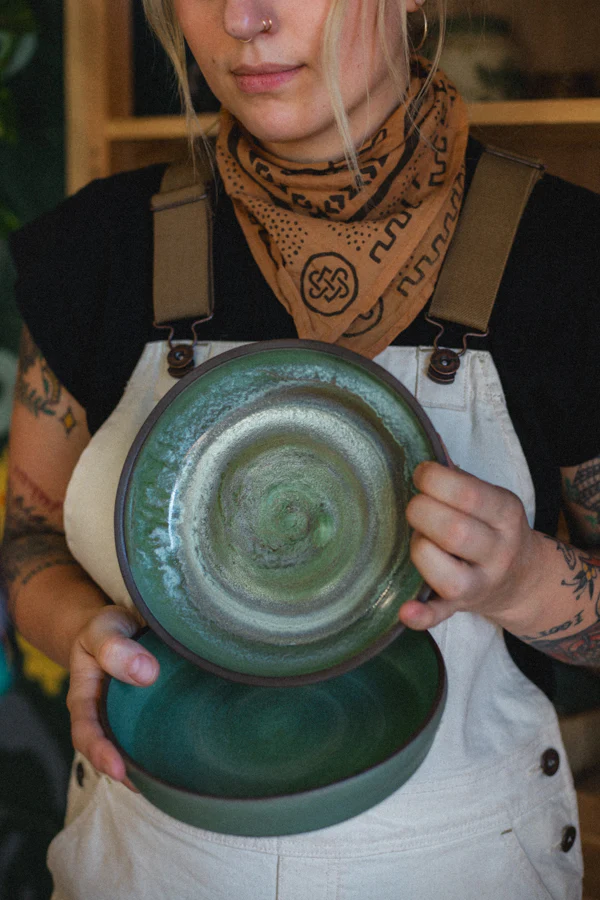
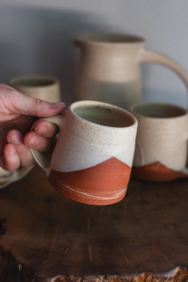
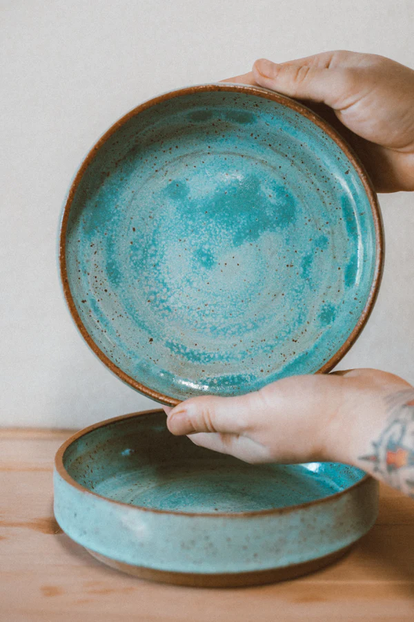
I connected with Gracie in Southern Oregon, as we are both crafters who love to make things. I was starting out my block printing artwork and she has just started making boob mugs for her friends and growing online community. The boob mugs took off, and she went along with the momentum, creating a brand centered around body positivity and acceptance. Over the next couple years, her pottery brand has grown and evolved to including much more than just booby mugs -- she now offers vases, tumblers, incense holders, popular blates (bowl-plates), and nature-inspired mugs with a variety of imagery and glazes.
As her offerings evolved, Gracie wanted to represent her brand in a new, more authentic way. Together, we re-branded her look from a sweet, playful style to a more rugged, natural look that represented her art and personal aesthetic that could last through future evolutions.
1. Tell me about your brand and what you offer with Amazing Gracie Pottery.
I create small batches of handmade ceramic goods at my home studio here in Southern Oregon! My main focus has been on mugs, bowls, and miscellaneous items like incense holders. But I'm headed in the direction of making more kitchenware, both for the home and for small restaurants/ cafes looking to add a handmade touch to their serving dishes.
2. How did you get to where you are today with your brand? How did it start?
I began with just a benign curiosity in pottery and opted for a 6-week beginners class at my local studio. During that 6-week course, I made my first boob mug, which took off like wildfire. The start of my brand was all centered around body representation in clay form. I made boob mugs representing all types of bodies, which triggered such a strong and positive response of belonging in my audience that was really fulfilling. Today, I have added more layers and brought in an emphasis on form and function that I'm excited to see reflected in my work.
3. Can you share a bit about the challenges and lessons you’ve learned along your journey to becoming a potter?
Yeah, the biggest lesson is that community is everything! Pottery is a craft that takes considerable time, money, materials, and equipment to learn. It almost requires community involvement to get off your feet and grow. I'd say most of my challenges and lessons in pottery were learned through my community- or through the lack thereof.
4. Why did you decide to rebrand from your original look?
My original branding was centered around the boob mugs, and as my skills and collections expanded, the branding felt limited.


5. What did you want to communicate through your new branding?
I wanted branding that communicated my love for the natural world, the rugged quality of my pottery, the limitlessness of the bird imagery, and earthy tones with pops of color that I enjoy in my work and decor.
"I'd say most of my challenges and lessons in pottery were learned through my community - or through the lack thereof."
6. How has your community responded to the new branding?
My community LOVES the new branding! I got to premiere the new branding at a market shortly after receiving the final files, and the response was so sweet! People came up to my booth just to tell me that my signage and logo were awesome.
7. How can readers find you?
Readers can find me on instagram at @amaazingracie_pots or on my website www.amaazingracie.com


Comments